Data Visualisation: An Unlikely Meeting of Art and Science
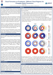
One of my favourite anecdotes from this summer was during a call with my supervisor, Christiane, and one of her PhD students, Dominic. After they discussed some theory, that I admittedly knew very little about, we started discussing the work I had been doing that week. I had been creating plots using python that showed the temperature distribution for the model exoplanetary atmospheres that we were using. I had generated one plot for each of the 144 planetary models in our grid, and Christiane wanted me to arrange all of them in one figure in our shared Latex document.
Feeling like I needed to puff myself up after having said virtually nothing during the entire meeting, I boldly announced that I would have this figure ready by the end of the day. This announcement was immediately met with laughter from Christiane and Dominic: they seriously doubted that I could create the figure in one afternoon. ‘Well’, I thought, ‘I’ll show them! I’m only arranging the figures I’ve already made in a table, how long could that possible take?’. One week later, I was still working on the figure, and I came to our next meeting a very humbled (and somewhat embarrassed) summer student. It was at that point I realised the importance, and the difficulty, of data visualisation in science.
As physicists, we often assume that most of our time is spent solving equations and coming up with grandiose theories about the nature of the universe. However, to understand in any detail how complex physical systems work, we rely on sophisticated numerical simulations, which often produce vast quantities of data. For example, after running our cloud formation code, ‘static weather’, for our entire grid of model planets, we now have just shy of 50GB worth of cloud properties. This is probably enough data for several master’s projects worth of analysis, so I needed to figure out how I was going to use this data in the time that I had left to answer my research question.
To do this though, I first needed to decide what I wanted to learn about the clouds: did I only want to know where they were forming on the planets, or was I also interested in their mineral composition? Which cloud formation property (nucleation rate, dust to gas ratio etc.) should I use to identify the cloud forming regions? And finally, which types of plots should I use to present the data?
Deciding the type of plot to use was a real killer. The data-cubes I had to work with had 4 dimensions of data: latitude, longitude, atmospheric pressure (a substitute for atmospheric height) and finally the cloud formation quantity in question. Generally, the best we can manage on one plot is 3 dimensions (an x axis, a y axis and a colour scale). Therefore, I had to decide which dimension to disregard, and consider what information might be missing. Eventually, I decided to use the same slice plots I had used for the atmospheric gas temperature (I wasn’t going to let that entire weeks’ worth of work go to waste, now was I?).
Even then, my work was far from over. I spent a large amount of time on seemingly trivial decisions. How big should I make the labels? How many tick marks should I use on the axes? How thick should the gridlines be? What colour should I use for the contour plots? For one plot, I had to use two colour maps overlayed on the same grid. I spent the better part of a day looking at how different colours contrasted, and how visually appealing they were to an observer. At one point, I felt more like Gok Wan than a summer research student.
Obsessing over these details was time well spent, however. The ability to visualise data in a clear and visually accessible format is one of the key skills of a researcher. Ultimately, the purpose of any paper is to make a convincing scientific argument based on the data you have available. If the paper has messy or hard to interpret figures, then it will be difficult for the reader to identify the trends or patterns in the data that support the argument you are trying to make. The significance of data visualisation is one of the many important lessons I have learned during my research project, so I thank my supervisor Christiane, Lord Laidlaw and the Laidlaw foundation for giving me this amazing opportunity.

I am a third-year PhD student at the Institute of Astronomy at the University of Cambridge. I work in Professor Oliver Shorttle's group, studying the atmospheres of hot rocky planets. In our solar system, Venus exemplifies the fate of a planet that orbits too close to its host star: a catastrophic runaway greenhouse effect leading to the loss of all liquid water and hellish surface conditions. Understanding the factors that led to this outcome on Venus helps us identify the conditions necessary for such processes to occur on exoplanets, refining our understanding of the inner edge of the habitable zone.
My recent work has focused on ozone production in Venus' upper atmosphere and the potential for ozone to present a false-positive biosignature on Venus-like exoplanets. Currently, I am extending my research on hot rocky exoplanets to include the sub-Neptune regime, particularly focusing on 'Magma Worlds.' There has been recent interest in Hycean worlds—planets with vast liquid oceans and hydrogen-dominated atmospheres—and their potential to support life. However, distinguishing observationally between Hycean worlds and sub-Neptunes with molten surfaces, or 'Magma Worlds,' remains a critical challenge.

Please sign in
If you are a registered user on Laidlaw Scholars Network, please sign in
This figures looks great - I’m glad you spent the time putting it together!