Like
Be the first to like this
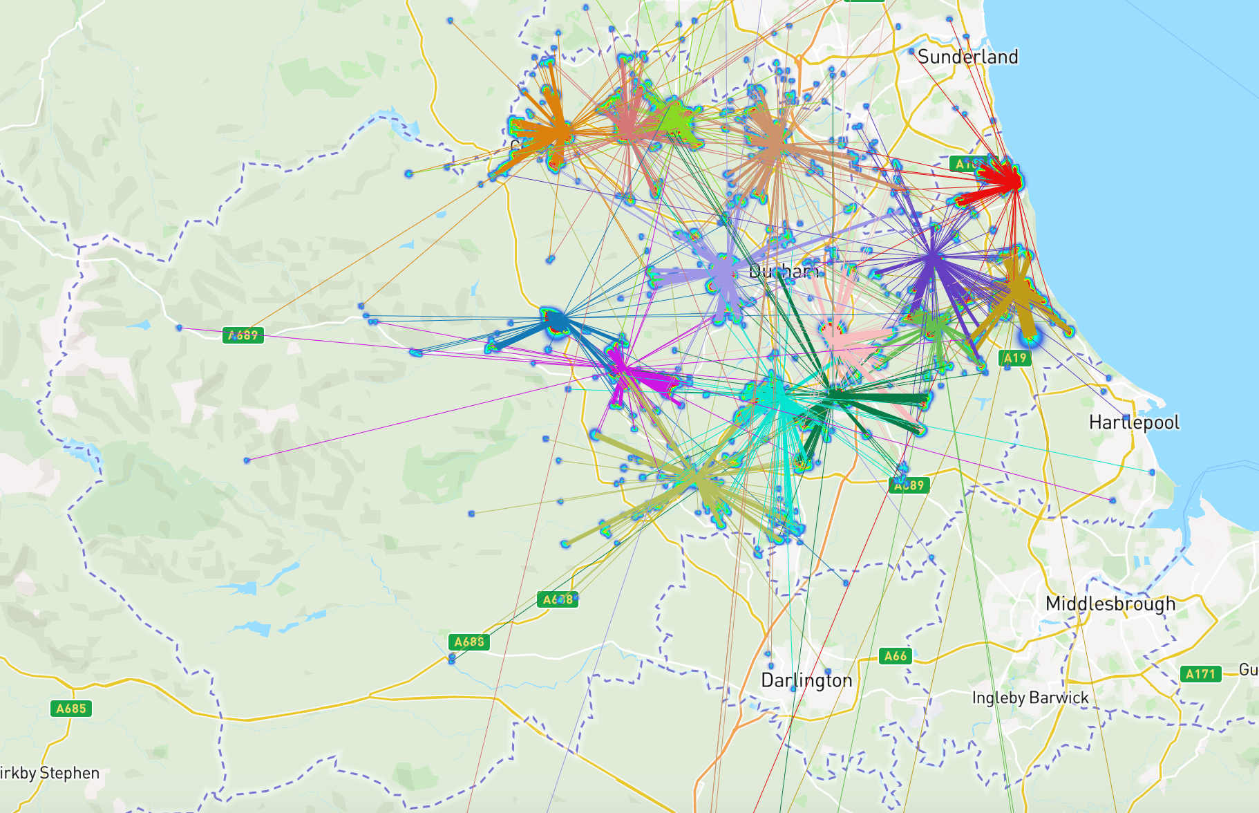
During this week, I have mapped the lines of which person on the heatmap travelled to where, this helps in visualising and understanding how far people travel to the hub and thus might have a need in having a hub in the nearby region.
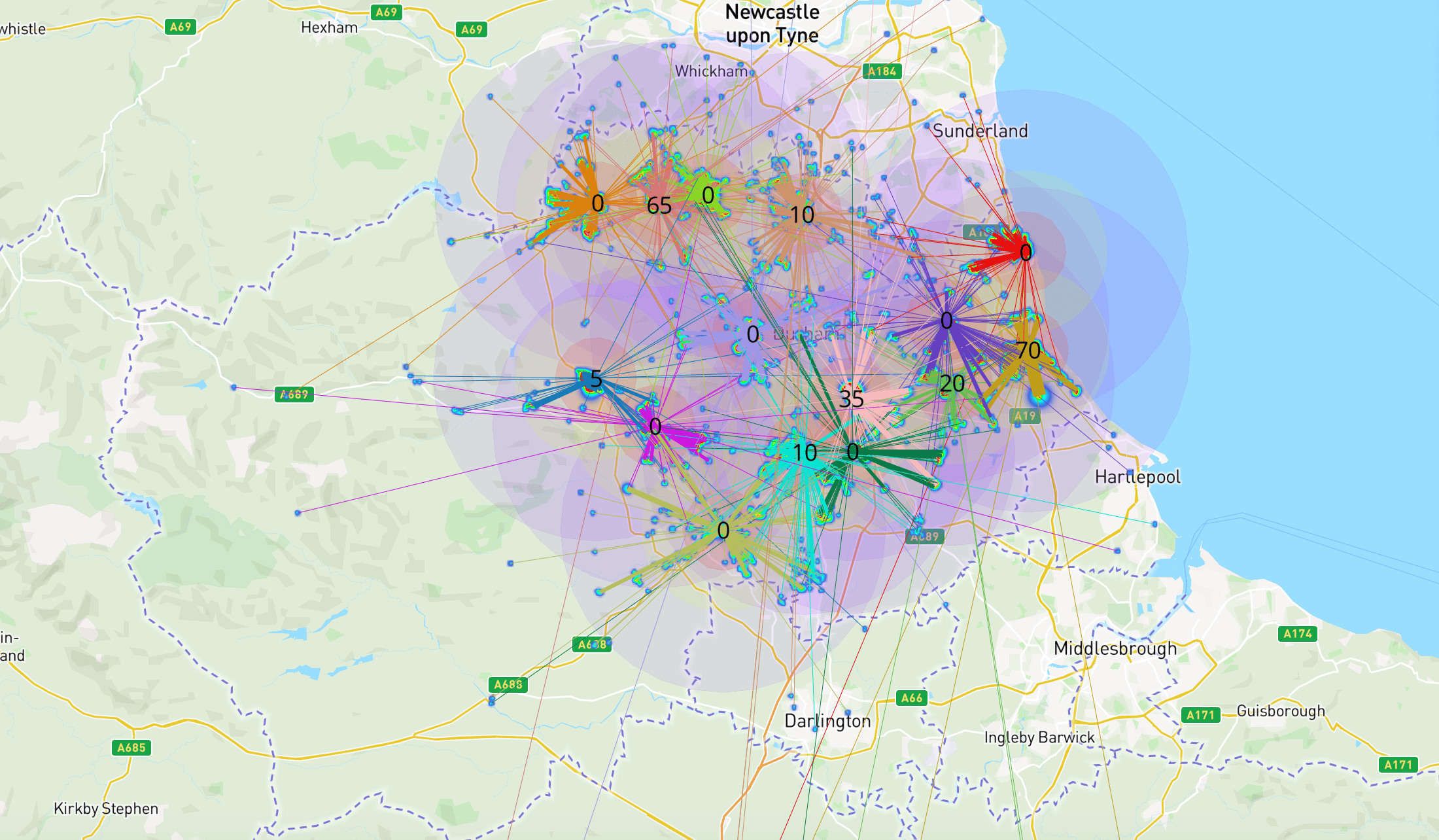
I have also added how oversubscribed each hub is, some hub are oversubscribed by close to 70, which is already close to the capacity of another hub.

I then added circles of radius of 5, 10 and 20 km to help visualise the distance
Economics and Finance, Politics and Public Administration Student, The University of Hong Kong
Please sign in
If you are a registered user on Laidlaw Scholars Network, please sign in